Learning Information Architecture (IA) as a Software Engineer
One of my biggest challenges in doing my hobby as an indie developer is designing the UI/UX. Coding a user interface when the design has already been beautifully crafted by professional designers is easy. However, it’s a completely different story when you are a solo developer and the only thing you know how to do is code.
Often, I’ll have a solid app concept and its features mapped out. I’ll do my product research and feel confident in the core idea, but I struggle with how to present it to the user. I find myself stuck asking questions like:
- Which feature deserves its own page?
- Which features should be front and center on the home screen?
- Which features can be grouped together into sub-menus?
As a result, I used to jump straight into coding. I’ll jam away on the keyboard without a clear design in mind. I would implement features while simply hoping for the best, praying that users wouldn’t find the app confusing.
This is a terrible habit, and it needs to change. Over the past few weeks, I’ve forced myself to learn more about UI/UX. Because UI/UX is an incredibly broad field, I needed to pick a small, manageable starting point. I decided that the first topic I wanted to learn was Information Architecture (IA).
🏛️ What is Information Architecture (IA)?
According to the Interaction Design Foundation:
“Information architecture (IA) is the discipline of making information findable and understandable. It includes searching, browsing, categorizing and presenting relevant and contextual information to help people understand their surroundings and find what they’re looking for online and in the real world.”
In the context of a mobile app, IA is essentially the blueprint of how information is intentionally displayed so users can navigate through the app effortlessly.
Before building an IA, however, I needed a project to work on. I chose a mobile banking app. Existing banking apps vary wildly in design and are packed with features, meaning there is an overwhelming amount of information to organize. It’s quite a challenge, but I knew I would learn so much.
Since mobile banking apps are typically feature-heavy, I narrowed the scope down to a few core features that I personally use on a daily basis:
- Dashboard
- Transfer (Same Bank / Other Banks)
- Transactions & Transaction History
- Notifications
This is usually the exact stage where I used to get stuck. Normally, designing an IA depends heavily on a company’s business goals and user demographics. Because this is purely a learning exercise, I decided to create a user persona based entirely on myself.
👤 User Persona & Scenario
- User Persona: Dimas, a 28-year-old Indonesian worker who wants a simple, minimalist banking app that feels effortless to use daily.
- Scenario: Wanting to transfer money easily and quickly without worrying about sending it to the wrong person.
- Expectations: Expects transfers to be as instantaneous as cash and worries about accidentally entering the wrong account details.
🗂️ Tiering the Features
To design the IA, I categorized and tiered these features based on three factors: frequency of use, urgency, and cognitive load.
- 0-Deep: Instant actions executed on the go (e.g., standing at a cashier or toll booth). Zero friction allowed.
- 1-Deep: High-frequency, daily or monthly financial routing.
- 2-to-3-Deep: Low-frequency configurations, security settings, or complex product exploration.
Here is how I tiered the features based on that framework:
- 0-Deep: QRIS, Check Balance (Cek Saldo), Account Statement (Cek Mutasi), Transaction History
- 1-Deep: Transfer Hub (combining Transfers, Virtual Accounts, Top-ups, and Billers), Notifications
- 2-Deep: Account Management & Settings
🎨 Results
1. Dashboard
The Dashboard is the first thing users see, so I placed the most frequently used features here.
Users can view their accounts as a carousel, check their balance, and toggle a show/hide button for privacy. I designed the carousel so the next and previous items peek in from the sides, subtly indicating to the user whether there are more accounts to scroll through. Also the dots indicator to show the currently displayed item position.
Since QRIS and Transfer are the most frequently used features, I intentionally gave their buttons a distinct design so they pop out, allowing users to focus on them immediately.
Below the Transfer and QRIS buttons, I added a customizable Quick Access menu. Users can add their own frequently used features here to speed up their journey. I also included a small ribbon with a “NEW” label on certain items to highlight new features and encourage users to try them.
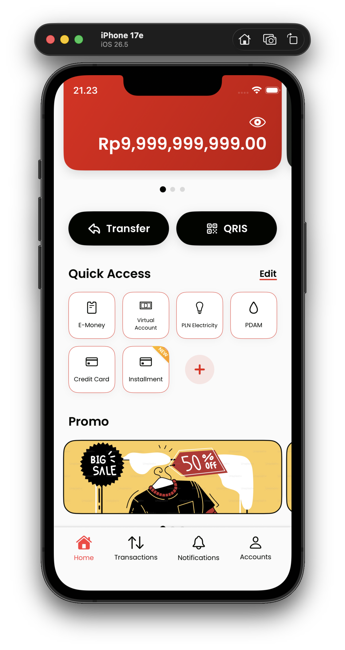
Next, I noticed that almost all mobile banking apps include a section for promotions. Usually to promote events, marketing campaigns, or fulfill business requirements. I gave this section the same carousel design as the balance cards for visual consistency.
Finally, below the promotions section, users can see their most recent transactions. I used progressive disclosure here to reduce cognitive load. Tapping “See All” navigates the user to a dedicated transaction history page. This page features a search bar to find specific transactions, along with filter chips to sort through history (Inflow, Outflow, Success, Pending, Failed, or All).
2. Transactions
The Transactions page contains all the transactions that can be executed within the app. Because this section is supposed to display a massive amount of information, I used a grid layout. A grid is an excellent way to show many items cleanly while still grouping similar categories together.
I also included a small ribbon with a “NEW” label on certain items to highlight new features and encourage users to try them. Finally, a search bar sits at the top of the screen so users can quickly find and access the specific feature they want.
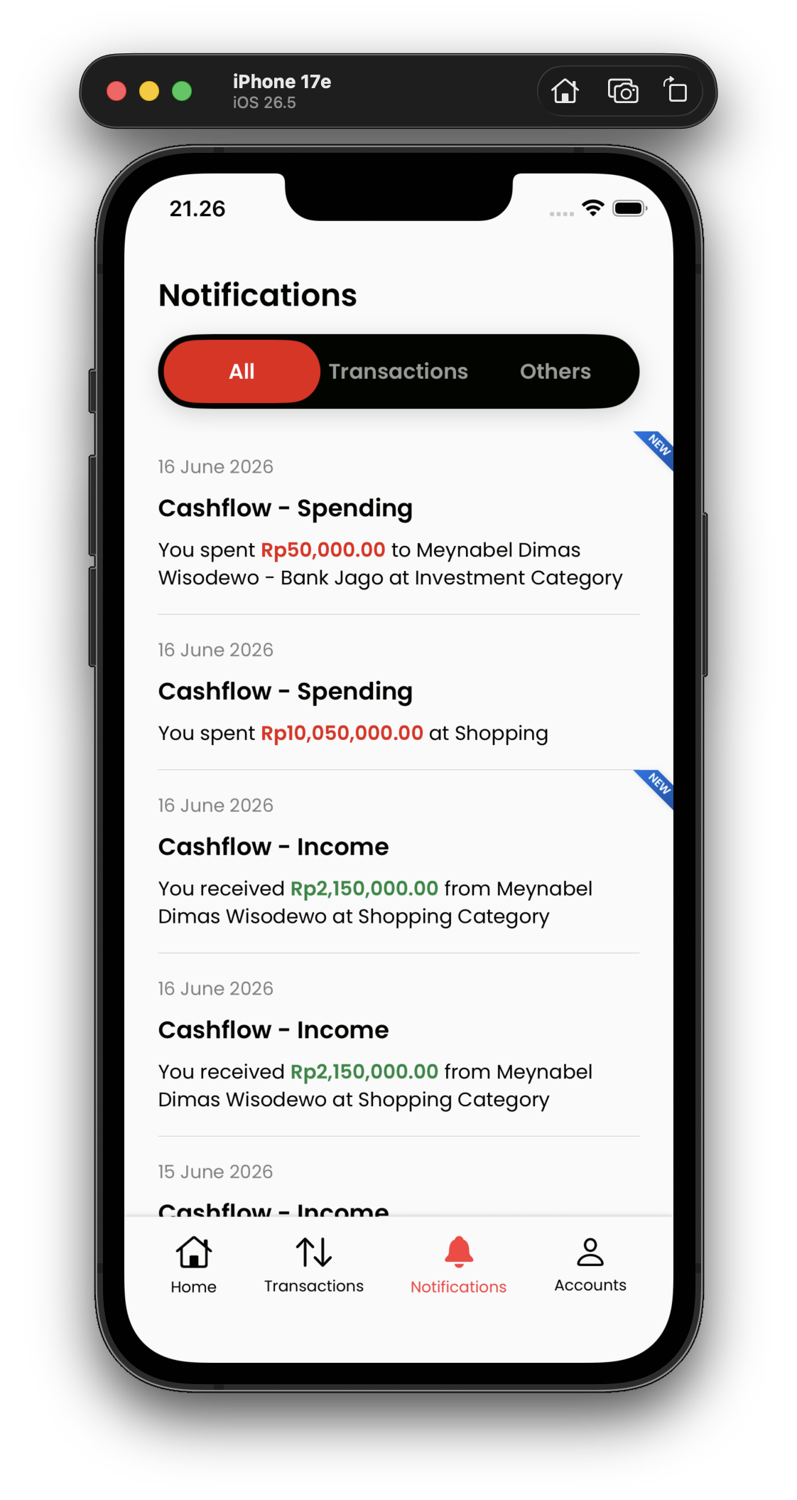
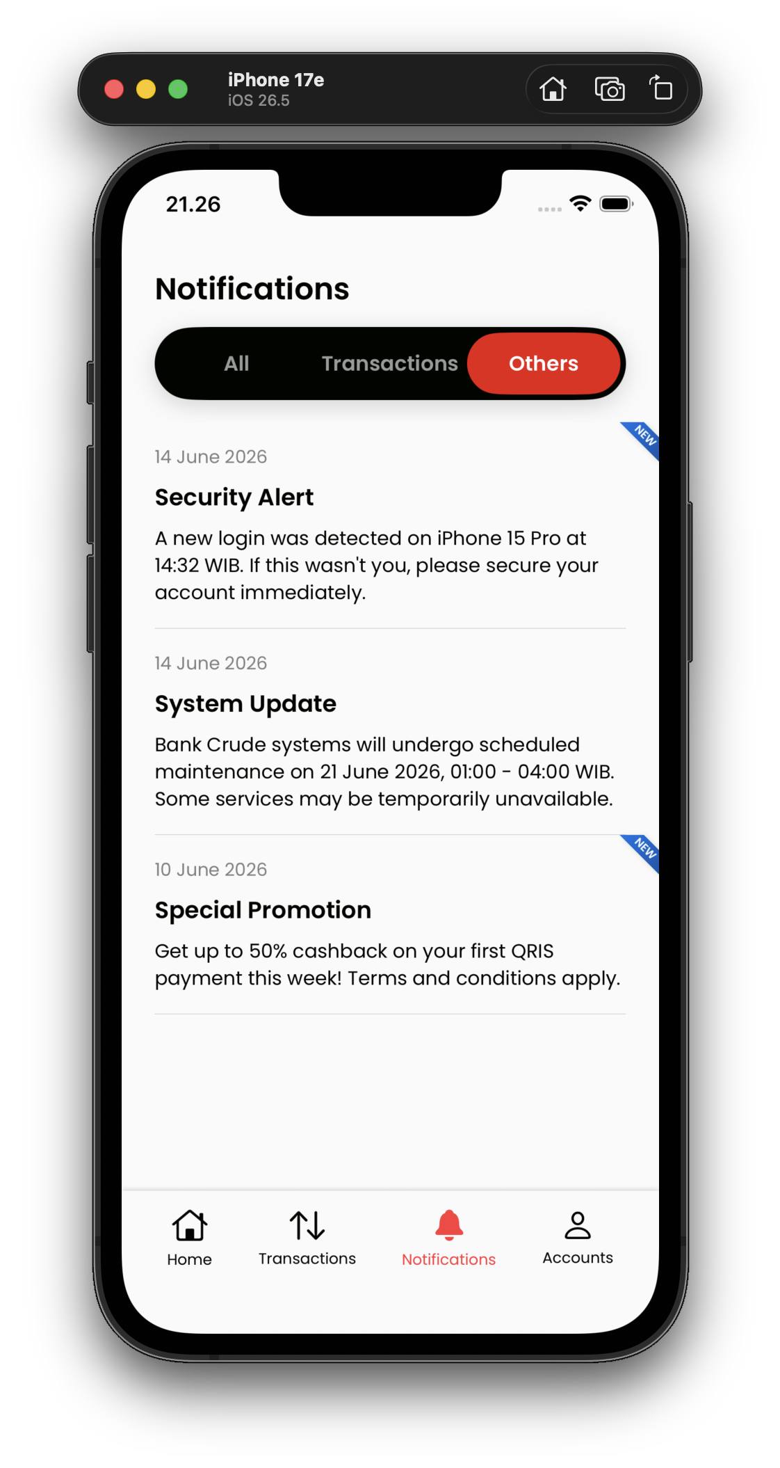
3. Notifications
The Notifications page displays all notifications. While this is actually the feature I check least frequently on a daily basis, I still open it quite often compared to deeper app settings just to confirm that my payments or transactions were successful.
I also added a segmented pill control at the top to filter notifications by category. This control specifically separates transaction related notifications from general ones. I also included a small ribbon with a “NEW” label to indicate unread notifications, but I used a different color to differentiate it from the NEW labels used for new app features.
4. Transfer Flow
One of the core features that I wanted to explore is the transfer flow. Users can simply tap on the prominent transfer button on the dashboard. The next page provides an option to transfer to a new beneficiary, while also displaying a list of saved destinations that can be searched using the search bar at the very top of the page.
The transfer form page contains a significant amount of information. To reduce the cognitive load for users, I grouped this information into three separate sections which are the Source Account, Destination Details, and Transfer Amount. Both the source account and destination bank selection views are displayed as a sheet instead of a new page because they are part of the exact same form filling process.
I also added chips with common amounts like 50000, 100000, and 200000 for quick selection, which was inspired by standard ATM interfaces.
Tapping either the new beneficiary button or an item from the saved destination list will navigate the user to the same page. The only difference is that when tapping a saved destination, the account number will be prefilled automatically.
Once the form is filled out, a confirmation sheet appears to ensure that the data entered by the user is correct. After confirmation, a loading page with a spinner animation appears because the transfer process takes a few moments.
When the transaction finishes, an acknowledgement page or receipt displays the status of the transaction that was just completed. I also included a floating button to save the destination, which allows for quicker future transactions without entering the account number manually.
Finally, the main call to action button navigates the user back home so they can verify the transaction history and status.
✅ Closing
I learned so much from this exercise, and I feel like understanding information architecture will greatly help me in developing my next solo mobile app project.
I used to hold a misconception about UI/UX, believing that a person needed a deep artistic sense to be a good designer. However, as my mentor, Bang Ackyl, always says, UI/UX is highly functional. We do not need to be artistic to start learning it. Having a strong sense for art certainly helps make a design beautiful, but beginners should focus first on making the design functional. Once we master functionality, we can learn how to make the design beautiful.
Sharpening an artistic sense takes time and cannot be done instantly. In the end, form must always follow function, and not the other way around.